I never met a cover of mine that I didn’t like. I know some authors who hate what they wind up with, but not me. From the first time I saw the sketch for my debut novel, ON THE VERGE – there were donuts worked in- to every random copy of my novels in numerous translations, I love them all. I have a couple of covers framed in my house and one day when I win that Mega Millions jackpot or get that big option, I will wallpaper the writer’s room in my eco-friendly lake house in book covers. The Danish version of UP & OUT is super cool (at least I think that’s what it is).
I guess it’s because when I see the cover I know that the book is soon to follow and I am grateful again that this is all happening. Maybe if I were a NY Times bestselling author I would be more picky, but I doubt it. I love seeing the way an artist decides to translate my book.
Things are a little bit different now that I am epublishing. I am told that covers aren’t as important in epublishing. People who buy ebooks aren’t browsing covers they say, but I don’t know if I buy it. Either way, now that I intimately involved in the process of creating the cover, I definitely want it to be good.
I am lucky that I am good friends with someone who makes covers for actual books for a real publishing company and she (I’ll call her Joan since we both like Mad Men and she is a sassy redhead) will trade a good meal for a book cover. It’s a win-win for me, because I love her style and this is great reason to go back to Brooklyn Fare.
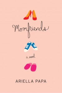
For my first epublished book MOMFRIENDS Joan gave me three different options. We went with a style that would appeal to my chick-lit fans. The cover was pink and had three different sets of shoes to represent the three women in the story. I asked for a tweak of the middle shoes to differentiate it more from the other two and Joan put in the cute blue kicks she happened to be wearing. I loved it. It totally got the vibe of the book. 
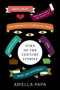
Then I decided I was going to epublish some short stories. All of these stories were set around Y2K, and sort of went together in my head. What I really needed was six separate covers. I needed covers that were different, but tied together. It was probably time to move away from pink. Joan suggested keeping some stylistic elements like my name placement and certain typography. I suggested incorporating some iconography from the stories and this is what we wound up with.
Again, I love it! As I release each story that story’s name will be the boldest, but all the names are still there. I’m working on a little trailer based on the cover. I’ve wanted to publish these TURN OF THE CENTURY STORIES for some time and I will be epublishing one every couple of months over this year. It’s kind of an experiment and we’ll see how it goes. In content and cover this is a departure for me and I’m looking forward to seeing how it turns out.
Because these books are epublished and I don’t get to hold the tangible book, seeing this cover was the moment where I started to feel like this book was going to be real.
What are YOUR cover stories? Are you always happy? Is epublishing changing how you think about them?


